
Image Optimization
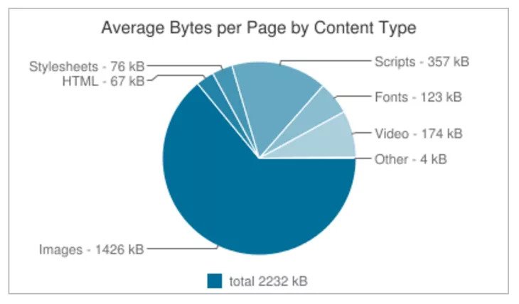
Image is easily the most heavy resources of many webpages.
However, to optimize image for webpages is not an easy feat. Ideally you need to:
- resize large images to the size needed based on design
- generate images of multiple size so the smaller screen only load the smaller images
- lazy load images to improve initial page load
- hold the image position so your page doesn’t jump while images load
- use optimized image format like WebP but provide proper fallbacks if it is not supported by browser
Fortunately, Gatsby has include plugins and component to make all these optimization much easier.
Use Gatsby Image in React Component
npm i gatsby-image gatsby-transformer-sharp gatsby-plugin-sharpmodule.exports = {
plugins: [
'gatsby-plugin-sass',
{
resolve: 'gatsby-source-filesystem',
options: {
name: 'src',
path: `${__dirname}/src`,
},
},
{
resolve: 'gatsby-source-filesystem',
options: {
name: 'blogs',
path: `${__dirname}/blogs`,
},
},
'gatsby-transformer-remark',
'gatsby-plugin-sharp',
'gatsby-transformer-sharp',
],
};mkdir src/imagesCopy your photo into the images folder and name it as my-image.jpg.
There are two types of responsive images supported by Gatsby:
- Images that have a fixed width and height. In this scenario, you want to have multiple image sizes for different screen resolutions.
- Images that stretch across a fluid container. In this case, you create multiple image sizes for different width.
Load a Fixed Size Image
Let’s load your photo by setting a fixed width of 500px.
import { graphql } from 'gatsby';
import Image from 'gatsby-image';
import * as React from 'react';
import { Layout } from '../components/layout';

const HomePage = ({ data }) => {
  const metadata = data.site.siteMetadata;
  const imageData = data.file.childImageSharp;

  return (
    <Layout>
      <h1>Welcome to {metadata.title}'s Website</h1>
      <p>{metadata.description}</p>
      <Image fixed={imageData.fixed} alt="Photo of Me" />
    </Layout>
  );
};

export const query = graphql`
  query HomePageQuery {
    site {
      siteMetadata {
        title
        description
      }
    }
    file(relativePath: { eq: "images/my-image.jpg" }) {
      childImageSharp {
        fixed(width: 500) {
          ...GatsbyImageSharpFixed
        }
      }
    }
  }
`;
Load a Fluid Size Image
import { graphql } from 'gatsby';
import Image from 'gatsby-image';
import * as React from 'react';
import { Layout } from '../components/layout';

const HomePage = ({ data }) => {
  const metadata = data.site.siteMetadata;
  const imageData = data.file.childImageSharp;

  return (
    <Layout>
      <h1>Welcome to {metadata.title}'s Website</h1>
      <p>{metadata.description}</p>
      <div style={{ maxWidth: 800, margin: '0 auto' }}>
        <Image fluid={imageData.fluid} alt="Photo of Me" />
      </div>
    </Layout>
  );
};

export const query = graphql`
  query HomePageQuery {
    site {
      siteMetadata {
        title
        description
      }
    }
    file(relativePath: { eq: "images/my-image.jpg" }) {
      childImageSharp {
        fluid(maxWidth: 800) {
          ...GatsbyImageSharpFluid
        }
      }
    }
  }
`;
Use Gatsby Image in Markdown
npm i gatsby-remark-imagesmodule.exports = {
plugins: [
'gatsby-plugin-sass',
{
resolve: 'gatsby-source-filesystem',
options: {
name: 'src',
path: `${__dirname}/src`,
},
},
{
resolve: 'gatsby-source-filesystem',
options: {
name: 'blogs',
path: `${__dirname}/blogs`,
},
},
{
resolve: 'gatsby-transformer-remark',
options: {
plugins: [
{
resolve: 'gatsby-remark-images',
options: {
maxWidth: 700,
},
},
],
},
},
'gatsby-plugin-sharp',
'gatsby-transfomer-sharp',
],
};